
>Welcome to the soyjak forum.
-
Boards are being moved around and added. Leave feedback in this thread and let jannies move your threads
You are using an out of date browser. It may not display this or other websites correctly.
You should upgrade or use an alternative browser.
You should upgrade or use an alternative browser.
how can i drawcaca with talent
- Thread starter mr_moose
- Start date

- Joined
- Jun 24, 2025
- Messages
- 11,082
@Sloppyjakky rape him
Mongoloigul
The Return of the Mongoloid Jungle
- Joined
- Apr 23, 2025
- Messages
- 2,104
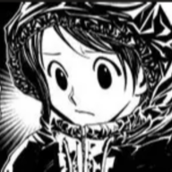
Robert Beverly Hale and Prokofor now im using my mouse and photoshop 2025 (wich keeps crashing after 5 minutes of drawing for some reason)
anywhays here are some of my tosses



- Joined
- May 8, 2025
- Messages
- 1,788

Sloppyjakky
all my detractors are pedos
- Joined
- Apr 23, 2025
- Messages
- 12,971

FartmingerFuckwadCheesest
"Oh, no, incoming fart attack!"


- Joined
- Apr 26, 2025
- Messages
- 15,889
That's something you'd know best, albeitITS A SCAM
Sloppyjakky
all my detractors are pedos
- Joined
- Apr 23, 2025
- Messages
- 12,971
Sloppyjakky
all my detractors are pedos
- Joined
- Apr 23, 2025
- Messages
- 12,971
>realmanAll gems btw. Ignore sloppybrappy hes a talentless noob real woman snowman who cannot draw. Just draw unnecessary bullshit and you will win
log the fuck in randalpooner
snuffereet
I hate my autistic son I want to kill my autistic
- Joined
- Apr 21, 2025
- Messages
- 964
try to find a reference photo, could be a photograph of a person, object, landscape, or a drawing, or a 3d model, etc. but i'd suggest not to use something you have personal attachment to as you may find yourself getting frustrated that you aren't able to capture its "essence".
with this photo, you can try to recreate it through drawing; if it doesn't look good on your first try (it often doesn't) try comparing it with your reference to see what breaks the illusion in your case, perhaps the proportions are off, or maybe they're correct but the drawing still feels stiff (in this case, i'd suggest paying close attention to the form or 3d shape and its depth with respect to the "camera" as flatness in posing is often the main culprit behind stiffness!) maybe you're referencing a landscape but things don't like up quite right and more textured areas like grass or rough rock look odd, try and map out the horizon line and use 3d grids to understand the form of more defined things like a house, and remember that our eyes see more in contrast than in absolute values or colors and will gravitate towards these edges (hence why line art is such a major element in art now) and for more continuous sections it becomes useful to etch out the effect it has on our eyes in relation to itself and the contrasted sections around it (like a field of grass contrasted to a sky and a tree and a rock) than to fill in every minute detail.
it's also useful to trace, but you have to use this wisely - i suggest that when you have your trace, play around with these discrete lines now, if you traced a photo of a guy maybe, start playing around with his proportions, try and move/rotate/transform any arbitrary part of his body to see how it changes the whole feel of the drawing, try and visualize, say, his expression different or his arms moved in some way and see if you're able to make it look good (multiple references are always useful!) test your ability to construct a 3d form in 2d space, the nose and chin jut out - try and convincingly rotate his head in an unusual direction; this was just for a guy, but these kinds of experiments in transformations help regardless of what you're creating
composition is one of the most understated elements in art, while also being one of the most significant. it's also one of the most "felt" elements, sure, things like balance and framing and clarity act as important guidelines, but they are also very forgiving (yet dummyed artists still manage to fuck it up all the time) the art of the past is your friend, not like you're going to be illustrating parables of betrayal with soyjaks (ev&oe that's aryan) lots of the great fresco and oil painters before the modernist era used composition to its greatest capabilities to guide the eye through a comprehensible narrative; if you have an open mind then the cubist, futurist, suprematist, and surrealist movements (among others) going into the purely abstract schools of art are also a great resource, as these begin to focus on more pure, non-narrative uses of composition
with coloring, if you just want to stick with soyjaks then color picking is fine, but if you want to take a step further then i suggest using limited palettes in a variety of artistic contexts to test how you're able to tie things together. you'll notice things like desaturated colors appear closer to the complement/opposite of the color that surrounds it, and the certain moods each color evokes, and how to use highlight colors (bright or highly saturated colors that force a contrast) etc. with shading/rendering, this is basically wedding your ability to understand 3d form and your understanding of value, color, and contrast.
remember, whether you like it or not, all of these elements are interconnected in some way or another, so if you stay attentive to learning you'll be able to refine your skills in several departments even if you originally meant to focus on just one... have fun :)
Sloppyjakky
all my detractors are pedos
- Joined
- Apr 23, 2025
- Messages
- 12,971
try to find a reference photo, could be a photograph of a person, object, landscape, or a drawing, or a 3d model, etc. but i'd suggest not to use something you have personal attachment to as you may find yourself getting frustrated that you aren't able to capture its "essence".
with this photo, you can try to recreate it through drawing; if it doesn't look good on your first try (it often doesn't) try comparing it with your reference to see what breaks the illusion in your case, perhaps the proportions are off, or maybe they're correct but the drawing still feels stiff (in this case, i'd suggest paying close attention to the form or 3d shape and its depth with respect to the "camera" as flatness in posing is often the main culprit behind stiffness!) maybe you're referencing a landscape but things don't like up quite right and more textured areas like grass or rough rock look odd, try and map out the horizon line and use 3d grids to understand the form of more defined things like a house, and remember that our eyes see more in contrast than in absolute values or colors and will gravitate towards these edges (hence why line art is such a major element in art now) and for more continuous sections it becomes useful to etch out the effect it has on our eyes in relation to itself and the contrasted sections around it (like a field of grass contrasted to a sky and a tree and a rock) than to fill in every minute detail.
it's also useful to trace, but you have to use this wisely - i suggest that when you have your trace, play around with these discrete lines now, if you traced a photo of a guy maybe, start playing around with his proportions, try and move/rotate/transform any arbitrary part of his body to see how it changes the whole feel of the drawing, try and visualize, say, his expression different or his arms moved in some way and see if you're able to make it look good (multiple references are always useful!) test your ability to construct a 3d form in 2d space, the nose and chin jut out - try and convincingly rotate his head in an unusual direction; this was just for a guy, but these kinds of experiments in transformations help regardless of what you're creating
composition is one of the most understated elements in art, while also being one of the most significant. it's also one of the most "felt" elements, sure, things like balance and framing and clarity act as important guidelines, but they are also very forgiving (yet dummyed artists still manage to fuck it up all the time) the art of the past is your friend, not like you're going to be illustrating parables of betrayal with soyjaks (ev&oe that's aryan) lots of the great fresco and oil painters before the modernist era used composition to its greatest capabilities to guide the eye through a comprehensible narrative; if you have an open mind then the cubist, futurist, suprematist, and surrealist movements (among others) going into the purely abstract schools of art are also a great resource, as these begin to focus on more pure, non-narrative uses of composition
with coloring, if you just want to stick with soyjaks then color picking is fine, but if you want to take a step further then i suggest using limited palettes in a variety of artistic contexts to test how you're able to tie things together. you'll notice things like desaturated colors appear closer to the complement/opposite of the color that surrounds it, and the certain moods each color evokes, and how to use highlight colors (bright or highly saturated colors that force a contrast) etc. with shading/rendering, this is basically wedding your ability to understand 3d form and your understanding of value, color, and contrast.
remember, whether you like it or not, all of these elements are interconnected in some way or another, so if you stay attentive to learning you'll be able to refine your skills in several departments even if you originally meant to focus on just one... have fun :)



- Joined
- Apr 21, 2025
- Messages
- 5,846
i read thsi and i appreciate the effort you put on writing this posttry to find a reference photo, could be a photograph of a person, object, landscape, or a drawing, or a 3d model, etc. but i'd suggest not to use something you have personal attachment to as you may find yourself getting frustrated that you aren't able to capture its "essence".
with this photo, you can try to recreate it through drawing; if it doesn't look good on your first try (it often doesn't) try comparing it with your reference to see what breaks the illusion in your case, perhaps the proportions are off, or maybe they're correct but the drawing still feels stiff (in this case, i'd suggest paying close attention to the form or 3d shape and its depth with respect to the "camera" as flatness in posing is often the main culprit behind stiffness!) maybe you're referencing a landscape but things don't like up quite right and more textured areas like grass or rough rock look odd, try and map out the horizon line and use 3d grids to understand the form of more defined things like a house, and remember that our eyes see more in contrast than in absolute values or colors and will gravitate towards these edges (hence why line art is such a major element in art now) and for more continuous sections it becomes useful to etch out the effect it has on our eyes in relation to itself and the contrasted sections around it (like a field of grass contrasted to a sky and a tree and a rock) than to fill in every minute detail.
it's also useful to trace, but you have to use this wisely - i suggest that when you have your trace, play around with these discrete lines now, if you traced a photo of a guy maybe, start playing around with his proportions, try and move/rotate/transform any arbitrary part of his body to see how it changes the whole feel of the drawing, try and visualize, say, his expression different or his arms moved in some way and see if you're able to make it look good (multiple references are always useful!) test your ability to construct a 3d form in 2d space, the nose and chin jut out - try and convincingly rotate his head in an unusual direction; this was just for a guy, but these kinds of experiments in transformations help regardless of what you're creating
composition is one of the most understated elements in art, while also being one of the most significant. it's also one of the most "felt" elements, sure, things like balance and framing and clarity act as important guidelines, but they are also very forgiving (yet dummyed artists still manage to fuck it up all the time) the art of the past is your friend, not like you're going to be illustrating parables of betrayal with soyjaks (ev&oe that's aryan) lots of the great fresco and oil painters before the modernist era used composition to its greatest capabilities to guide the eye through a comprehensible narrative; if you have an open mind then the cubist, futurist, suprematist, and surrealist movements (among others) going into the purely abstract schools of art are also a great resource, as these begin to focus on more pure, non-narrative uses of composition
with coloring, if you just want to stick with soyjaks then color picking is fine, but if you want to take a step further then i suggest using limited palettes in a variety of artistic contexts to test how you're able to tie things together. you'll notice things like desaturated colors appear closer to the complement/opposite of the color that surrounds it, and the certain moods each color evokes, and how to use highlight colors (bright or highly saturated colors that force a contrast) etc. with shading/rendering, this is basically wedding your ability to understand 3d form and your understanding of value, color, and contrast.
remember, whether you like it or not, all of these elements are interconnected in some way or another, so if you stay attentive to learning you'll be able to refine your skills in several departments even if you originally meant to focus on just one... have fun :)
Sloppyjakky
all my detractors are pedos
- Joined
- Apr 23, 2025
- Messages
- 12,971
I didn't read any of that shit I just wanted an excuse to post thise


Sloppyjakky
all my detractors are pedos
- Joined
- Apr 23, 2025
- Messages
- 12,971
don't it's not possible to get good at arthow can i drawcaca without talent?
you either have to be japanese or be born with said skill
CX2
I AM A cacaOT
- Joined
- Jan 30, 2026
- Messages
- 27,778
im a jappo-confederate & i cant drawdon't it's not possible to get good at art
you either have to be japanese or be born with said skill
Sloppyjakky
all my detractors are pedos
- Joined
- Apr 23, 2025
- Messages
- 12,971
ur half so ur not fully japaneseim a jappo-confederate & i cant draw
- Joined
- Jul 12, 2025
- Messages
- 13,866
Chloroform
gffhsjxhwidwixwndk
- Joined
- Aug 5, 2026
- Messages
- 1,316

- Joined
- Jan 29, 2026
- Messages
- 15,167

- Joined
- Jan 23, 2026
- Messages
- 5,069
Members online
- Apolloyon
- condolana
- cirno.enthusiast 2
- Tuna
- Sloppyjakky`
- Apeson
- Doe
- Michael Robertson
- OrHoweverTheBurgerIsEaten
- MayaZazel
- Shiny
- Idkchud
- Joseph
- miek
- pootis
- swaggrz
- Greg
- lifesucksthenyoudie
- rittie
- raok
- shipment
- worldatwar
- StudioExcréments
- Zuse
- Synonymous
- Goot
- modderola
- Soyspotter
- GOLD TYRONE
- CascadiaWON
- Barry
- lampsonlighter
- Thrembolone
- Bee
- Dangeresque
- Perfect Pepsilord
- Chudsontalks
- supernigga
- kriper2004
- Lateral
- YellowLee
Total: 450 (members: 52, guests: 398)


